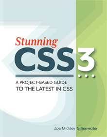
Stunning CSS3
A Project-based Guide to the Latest in CSS
Example Code
View the example site
In Chapter 6, you'll learn how to optimize a site for mobile devices and different screen sizes using CSS3 media queries. Try out the fictional Little Pea Bakery site from the book exercises at a variety of different window sizes to see how it adapts to keep the design easy to use and looking great no matter what the user's configuration.
Download exercise files
Each of the chapters is made up of at least one exercise where you will have the opportunity to implement the techniques in a real page, step by step. I've provided both a starter file and final file for each exercise, as well as a few intermediate steps for the longer exercises, so you can check in periodically and make sure you've made the correct changes to your own files.
If you bought the book, you can download the files for all these exercises for free and use them to work along with as you go through the steps of each exercise. To access the exercise files, go to www.stunningcss3.com/code/exercises. The username is scss3 and the password is the first word of chapter 7 (not the title, but the intro text, on page 243 if you have the printed book), all lowercase. All files have been zipped.
- Chapter 2: Speech Bubbles
- Chapter 3: Notebook Paper
- Chapter 4: Styling Images and Links by Type
- Chapter 5: Improving Efficiency Using Pseudo-classes
- Chapter 6: Different Screen Size, Different Design
- Chapter 7: Flexing Your Layout Muscles
